Compressing the 1 hour to 1 week long bootstrapping scan time will significantly improve both sales cycle time and conversion rate.
Barracuda ETS
Leaping over big barriers to keep companies protected.
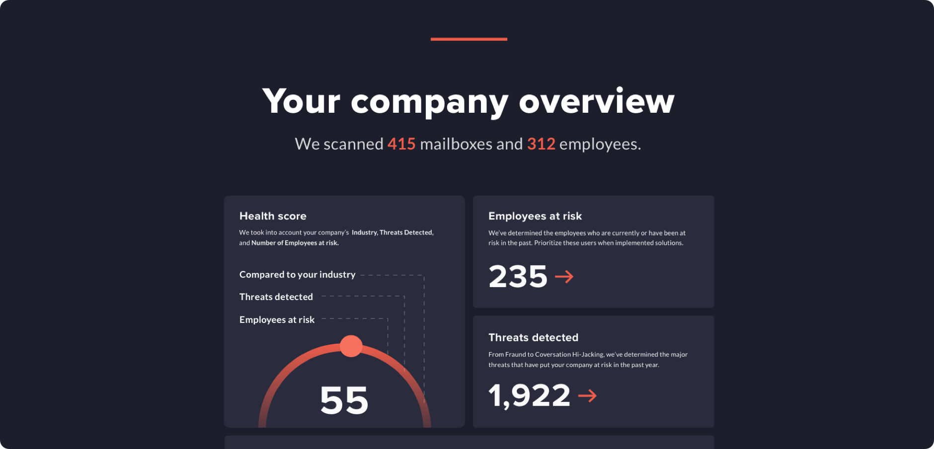
Leaping over big barriers to keep companies protected.

Kicking off the project, it was clear there were many opportunities with the ETS scan — the biggest two being:
Needing to accept an unexpected list of invasive permissions.
Scans could unexpectedly take weeks to complete.
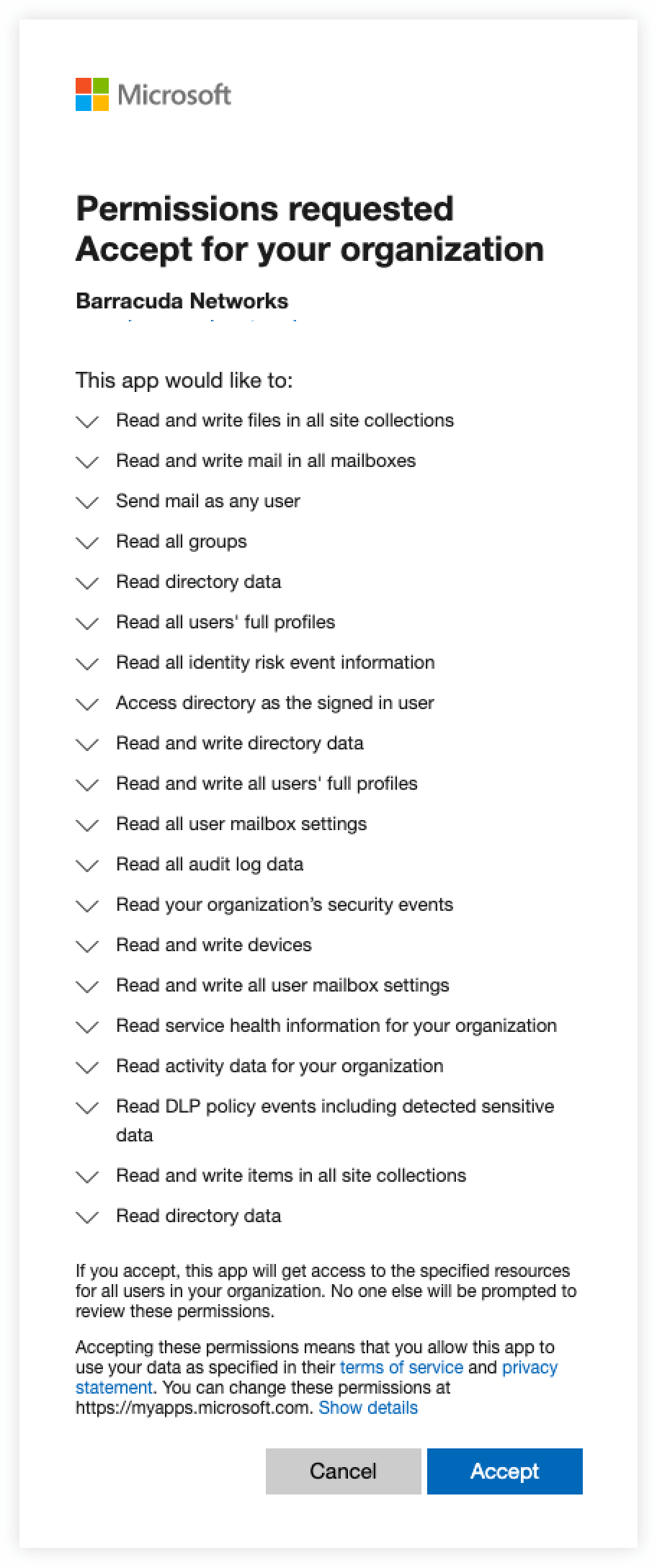
Yeah… it was a lot.
Working with a designer and ux researcher we quickly assembled a series of hunches and opportunities we could test with our targeted audience of 5k people to help provide feedback. Some of our top hunches included:
Compressing the 1 hour to 1 week long bootstrapping scan time will significantly improve both sales cycle time and conversion rate.
Optimizing the report to highlight attacks involving CEO/CFO/IT Admin will improve conversion rates to sales.
Adding intermediate results while full scan is running to Barracuda’s customers will improve conversion rates and engagement.
Adding a progress bar to the Barracuda’s scan results will improve prospect engagement.
Over the course of the project, we continued to evaluate a list of 60+ opportunity areas to affect future growth. Check out the full weighted opportunity list here.

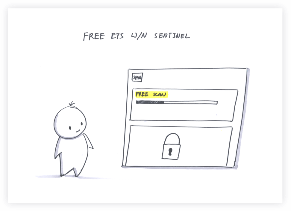
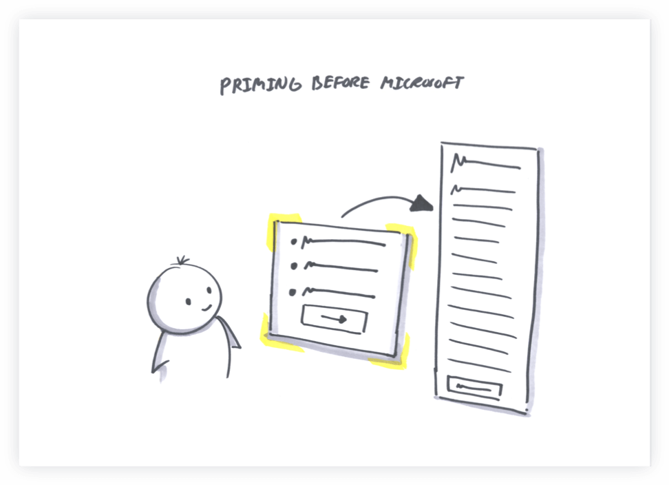

In the 2-3 day work cycles, we worked directly with the VP of Product, a UX Designer, and an Engineering Lead to move at lightning speed. We also had two presentations with the COO and CMO - one mid-project, one as a final handoff.
With our super team assembled, and our opportunities identified. We jumped directly into exploring User Journeys and honing in the ideal workflow.
As we tested the number of free scans a user could perform, a surprising insight emerged. The current unlimited free scan model had negative emotions rather than a limited set of 5 - 10 free scans. Even though people overwhelmingly performed one scan before making their decision, this irrational finding helped position the free ETS journey.
Check out the Testing
After 4 weeks, we found ourselves in a great, but difficult position. We had two great approaches for the ETS report:
Both were testing well, but our gut was telling us to move forward with the digital paper direction for a few reasons:
A linear, potentially more compelling story.
Ease of sharing.
Robust animations to surprise and delight.
While our primary focus was on the single ETS experience, we wanted to create a compelling visual direction that could help lift the suite of products Barracuda offered. We thoroughly tested the different visual directions to find the right balance of fear and trust.
In the last week, we fully realized our visual direction with some prototypes in Principle as well as a compelling presentation for leadership at Barracuda.
Some of the biggest wins we saw were:
Improvement in lead generation funnel
Increase in engagement
Decrease in fear as expressed by users